Skincare Brand Logos
It’s no secret I’ve been working at a medical spa as of late. When I graduated last year, it was just as COVID-19 quarantine and lockdown rules went into effect, so I didn’t really get the chance to job hunt the way I expected to. I’m grateful to have gotten this job, and while it wasn’t the dream job I wanted, it’s what I needed. And having what you need is a blessing in and of itself. And what I have right now, is a job at a medical spa that introduced me to all sorts of luxury skin care brands, their products, their parent companies, and more.
Our current audience consists primarily of middle age Asian women. These women are focused on making sure their skin looks young, so with that comes procedures such as Ultherapy and Thermage that help boost collagen production to smooth fine lines and lift sagging skin.

Ultherapy logo. The logomark is a goldenrod colored squiggly line that grows smaller and the logotype ‘Ultherapy’ uses a wide typeface with an extremely high x-height. The logotype is in a dark gray.
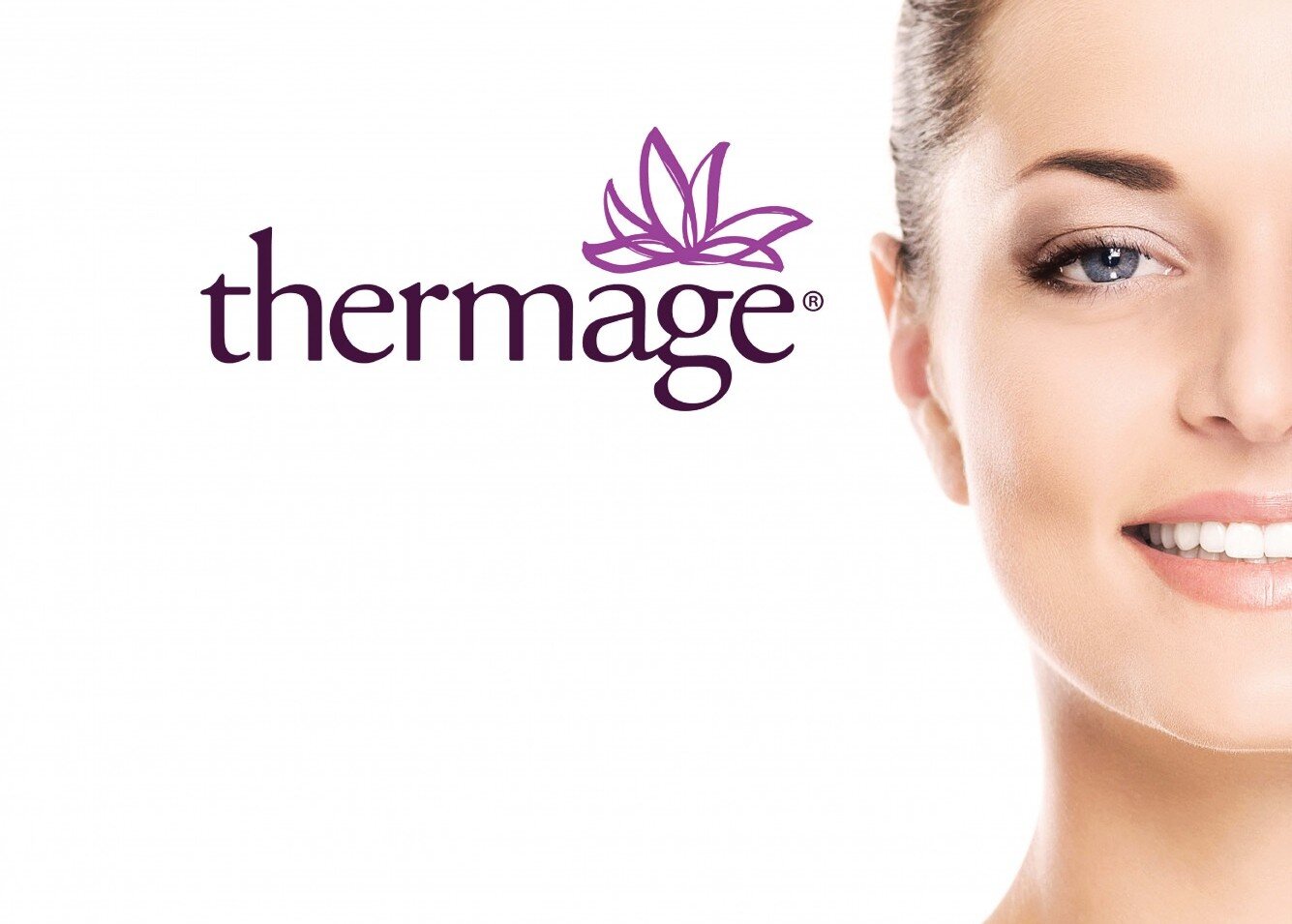
Thermage logo, along with the partial face of a white woman who models for Thermage. The Thermage logo is stylized in a lowercase partial serif font, and the ascender on the ‘h’ is much higher than the ascender on the ‘t’. There is a lotus flower-like brushstroke graphic that sits above the ‘age’ in ‘thermage. The logotype is in a dark purple, while the lotus flower graphic is in a lighter purple.
To me, while the logos do their job, neither really tell a story. I have absolutely no clue what the gold squiggle in Ultherapy is supposed to reference, beside possibly “the appearance of wrinkles decreasing over time.” The Thermage lotus flower? I dunno, possibly something about looking as beautiful as a flower?
I guess I’m just really fond of logos that tell a story. The current Xeomin logo does a much better job of it. (Fun fact, Xeomin is owned by Merz Aesthetics, the same folks who own Ultherapy.)

Xeomin logo. The ‘X’ in Xeomin is stylized as a magenta hand-drawn X, and part of the stylization makes it look like the marker was running out of ink while the X was being drawn. The rest of ‘Xeomin’ is in a bold black sans-serif font, all caps. The word ‘incobotulinumtoxinA’ rests underneath, and uses a wide sans-serif font with an equally tall x-height.
The Xeomin logo looks bold, in-your-face, and demands attention. It has the personality of a sharp-eyed well-dressed businesswoman who has no time for bullshit and will get the job done, even if it means having to do it herself. And most of the personality of the Xeomin logo comes from the stylized X. It feels a little rebellious, and the logo is not the wholly refined look one would expect from luxury.
The newest brand we’ve started selling at work is La Maison Valmont.
Valmont logo. The logomark and logotype is in a gold serif font, and uses an extremely tall small caps for the ‘almont’ in ‘Valmont’. The logomark consists of the capital V of Valmont, with a crown shape above it.
The Valmont logo is truly luxurious and refined. It commands attention, and it receives it. The representative from Valmont told us how the crown shape above the V calls back to the silhouette of the original building in Switzerland, and it also reflects the high-end ingredients in all Valmont products. It was at that building that all of classic Hollywood would go to for their pampering and skin care. Valmont has a legacy behind it and the logo carries that gravitas.
It’s pretty obvious where my preferences in these four logos lie. These biases also reflects how I try to design. My little catch phrase on this portfolio is ‘Eliot Leung = graphic designer + storyteller,’ after all. But I’m also wondering, am I simply being deaf to the story of Ultherapy and Thermage? Is there something between the lines I’m missing?
Ultimately, the story is lost right now. But who knows? Maybe I’ll find it one day. Meanwhile, I’ll be working at this medical spa.
Tokyo 2020
I’m going to be honest. I didn’t like the final logo at first. I don’t know if I like the final logo even now, as olympic athletes compete with each other in Tokyo, as seventeen year old Lydia Jacoby, fresh out of high school, wins the gold for the USA.

The final four candidates for the Tokyo 2020 Olympics logo.
Logo A: the winning logo. Harmonized checkered emblem. Inspired by Ichimatsu Moyo, checkered indigo textile design. By Asao Tokolo.
Logo B: Connecting Circle, Expanding Harmony, by Kozue Kuno
Logo C: Surpassing One’s Personal Best, by Takaaki Goto
Logo D: Flowering of Emotions, by Chie Fujii
Side note, I’m absolutely stunned by Lydia’s performance. I saw a tweet that there’s apparently only one olympic sized swimming pool in her home state of Alaska, and I’m proud of that kid for being as awesome as she is.
Anyway, it’s taking me a lot of time to warm up to the logo. Originally, I had seen Daren Newman’s version of the Tokyo 2020 Olympics logo and I had fallen in love with it. It was clever and witty, after all.
Daren Newman’s take on the Tokyo Olympics logo. Highly stylized letterforms turn the number 2 into parts of olympic rings, while the number 0 is stylized into a perfect circle. The red olympic ring is a filled in red circle, referencing the red circle in the Japanese flag.
And then the COVID-19 pandemic hit and I became a virtual hermit to anything news related, Olympics included, for about a year.
Fast forward to today, I’m watching the Olympics on TV, and I decide to look up the logo again, and am greeted by a circle of checkered squares. Or chequered, if you want to spell it the British way.
I thought it was plain at first. Boring, even. I sat at my laptop, brows knit, scrolling at the other finalists’ logos. Why didn’t they go with something more colorful?
It wasn’t until I dug a little more did I realize the cultural significance between the indigo squares. How the indigo represents an elegance you don’t really find elsewhere, and how it calls back to traditional textile design.
(Did you know? According to sixth-generation indigo farmer, Osamu Nii: “The indigo-dyed cloth seemed to be good for wounds because it protected [the samurai] and prevented bacteria.” [source] Not sure if this is the same indigo used in aforementioned textile design, but I was finally beginning to understand its significance in Japanese culture.)
And after even more digging, I began to understand why the other finalists weren’t chosen. Simply put, it can’t really be applied to any other medium, not easily or beautifully.
Either a mockup or actual photo of souvenirs from this year’s Olympics. The checkered pattern lays out beautifully on a porcelain plate, and the entire emblem is displayed on various other goodies, such as keychains, buttons, pins, a travel mug, and what I assuem to be a towel.
Frankly, I’m not sure what these are, besides boxes and tubes with the checkered pattern on it, but it looks damn good. This is what I mean by being applied to other mediums.
It was the above photos from My F Opinion’s blog post that changed my mind about the logo. After seeing these photos, I knew that you couldn’t really use the other finalists’ emblems in other mediums nearly as beautifully. As much as I love an insane amount of color, and as graceful as the morning glory inspired emblem is, you can’t easily apply that logo to any form you want.
That sort of logo demands a very specific color of background, demands to be used in very specific settings, and ultimately can be fussy to apply to other forms.
So we go back to the most minimalist of logos, the checkered pattern logo. We go back to minimalist Japanese design, and we go back to tradition to find our logo. That’s why the checkered design was chosen. There’s beauty in simplicity, and the final Tokyo 2020 logo exemplifies that.